Wednesday, October 14, 2009
Word Play
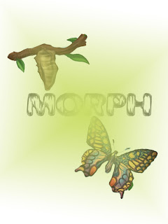
I chose to use the word "morph" because I like what it symbolizes. When I think of things changing in form the first thing that comes to mind is cocoons and butterflys. I found the font on the internet called weathered and I thought it fit well with the theme. To make the green background I choose a green fill layer in the shape of a diamond an extended it to the edges of the page. I also used the shading filter to make "morph" look more "morphed"
Poster 2
I still focused on the idea of health care reform.
I chose not to use any text for this poster.
I chose the images based on the key components of the players of reform in this country. I used a lot of distortion filters to create the feel of the circular motion. I thought it looked bold against the black background. This version is a lot more serious than my original.
Tuesday, October 13, 2009
Poster Project
I choose to uses cartoon graphics for this health care reform because I feel that it makes the concept of the poster easily understandable. The symbols are bold and represent the different aspects of the system. A lot of these graphics had to be cut away from there background so I used the magic wand tool to select and cut and paste the images to the final document. I selected the new fill layer to add the color. I used the text box in photoshop to add the phrase. I chose white so that it would pop off the page. My goal for this poster is that it would be simplistic.
Thursday, October 8, 2009
Collage 2
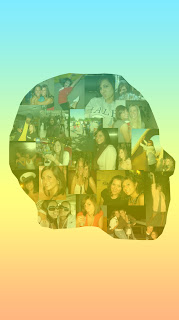
This was a completely different take from my first one. The outline is actually Obama's profile but I used all pictures of me and layered them using the clipping mask tool. The pictures were then able to form directly to the shape of the face. I thought that it needed a background also so I used the gradient fill tool and played around with the colors until I got something that was bright but still transparent enough to see the images clearly. I struggled a little bit with merging the layers together because there were several layers at one point. It's useful to know that if you hold down the apple key and click on the image it will navigate you directly to that layer. I enjoyed this project.
Collage 1
Obama's Inauguration was definitely one of the most influential days of my life and the images that were captured that day outline a part of who I am. I choose to use the American flag as the background and guidelines to my personal collage because I thought it was suitable to the topic. My goal was to my political and patriotic side. I especially liked using the burn out tool because it made the black from the images pop against the red and white background. I set my favorite image of the capital building as the background by lowering the capacity. I only left two pictures in their normal filter and angled them to make them seem as though they were in the foreground.
Subscribe to:
Posts (Atom)