Thursday, September 24, 2009

Moving Images


When I first thought of this project both water and wind came to mind. They are both calm and when I imagine them, I see them in motion.

I found this great image of the sailboat on a great background and attempted to make it seem as though the sailboat was in motion but disappearing with the tide as well.

It ONLY took me 90 minutes to erase the entire background surrounding the boat to be able to just have the boat seem as though it was traveling on the same water. The image is from the perspective of the someone watching from shore. Although they know the water is moving as well the boat seems to sail by while their mental image remains on the background.

I used the filter "wind" to make the transition of the boat diasppearing from the viewers mental image seem swift yet soft at the same time.
Thursday, September 10, 2009

Adding the image

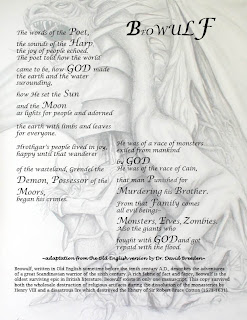
Today I got feedback from the class on the format of my poem. I decided I liked the font but that the title didn't seem like much a title at all and needed to balance the white space on the right side of the page. I originally played with fading the previously bold words, but when I chose to use the dragon image as my background, they blended in too much. This image drew my attention but I still liked the format of the poem and wasn't willing to change it. There wasn't much open space for the image so I enlarged it and made it opaque by adding a white layer using the fill button. Then I transferred the image to In Design by saving it as a jpeg and "placing" it on my already edited poem. I like the boldness of the black and white but in future projects I'm looking forward to experimenting with color. I have used Photoshop in the past but it has so many features that it is a bit overwhelming for the "second" first time. I am excited to play around and get to know In Design better as well. *Key that I need to remember is SAVE AS JPEG, I wouldn't be able to upload anything on to this bog otherwise.

Thursday, September 3, 2009

IDD Beowulf Poem


Hooray, my first day of IDD experience ever! I choose the Beowulf poem to design a layout for because the words had potential to be fierce and jump off the page. My goal was to make something stand out since my only knowledge of graphic design, as of yet, is to create something visually appealing. My thumbnail, although larger than the size of a thumb, actually portrays my final product. I used "In Design" to create this (Image to the right). I wanted to have the paragraphs side by side but still seem to flow in sequential order towards the bottom of the page. I chose to increase the font size of words that correlate with one another. I wanted to emphasize the authors use of God in order to illustrate the theme of the poem. Both the title at the top of the page and the author at the bottom are in Lucida Handwriting. I wanted it to seem as though the author was signing the poem. The rest of the poem is printed in Lucida Calligraphy. The explanation of the poem is printed more simply in Lucida Bright.