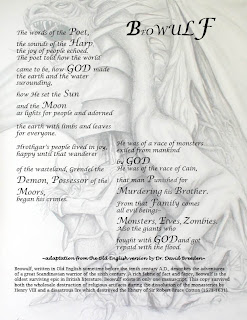
 Today I got feedback from the class on the format of my poem. I decided I liked the font but that the title didn't seem like much a title at all and needed to balance the white space on the right side of the page. I originally played with fading the previously bold words, but when I chose to use the dragon image as my background, they blended in too much. This image drew my attention but I still liked the format of the poem and wasn't willing to change it. There wasn't much open space for the image so I enlarged it and made it opaque by adding a white layer using the fill button. Then I transferred the image to In Design by saving it as a jpeg and "placing" it on my already edited poem. I like the boldness of the black and white but in future projects I'm looking forward to experimenting with color. I have used Photoshop in the past but it has so many features that it is a bit overwhelming for the "second" first time. I am excited to play around and get to know In Design better as well. *Key that I need to remember is SAVE AS JPEG, I wouldn't be able to upload anything on to this bog otherwise.
Thursday, September 10, 2009
Adding the image
 Today I got feedback from the class on the format of my poem. I decided I liked the font but that the title didn't seem like much a title at all and needed to balance the white space on the right side of the page. I originally played with fading the previously bold words, but when I chose to use the dragon image as my background, they blended in too much. This image drew my attention but I still liked the format of the poem and wasn't willing to change it. There wasn't much open space for the image so I enlarged it and made it opaque by adding a white layer using the fill button. Then I transferred the image to In Design by saving it as a jpeg and "placing" it on my already edited poem. I like the boldness of the black and white but in future projects I'm looking forward to experimenting with color. I have used Photoshop in the past but it has so many features that it is a bit overwhelming for the "second" first time. I am excited to play around and get to know In Design better as well. *Key that I need to remember is SAVE AS JPEG, I wouldn't be able to upload anything on to this bog otherwise.
Subscribe to:
Post Comments (Atom)

No comments:
Post a Comment