Wednesday, December 16, 2009

Final: Mood Board


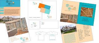
I chose a remodeling company, Homeworks to create a design plan for. For the logo I used large 3-D constructed letters to appear as though the H and W were built of wood. My mood board includes a full page ad, a website design a four page brochure, a t-shirt give away, business card, envelope and stationary design. I used shades of blue and orange as my color scheme; pantone 631 C, 713 C, 151 C and 320 C. I strategically placed them to create an appealing corporate identity package.

Wednesday, November 25, 2009

Homeworks Logo


I was very undecisive when it came to desigining this logo. I wanted it to be simplistic with a pop of color. I downloaded a variety of fonts to play with that would illustrate construction or a remodeling company. I ended up using a 3D letter font that I found online for the H and the W. I thought it made it look like the letters were being built. I also wanted to create a triangle or roof looking object for one of the words. For clarification purposes in smaller print I wrote remodeling co. I originally made the design in In Design but then moved it to Illustrator so that I could save it as a PNG. I think that this logo is multi-faceted and can be used on a letter head or business cards as well as become life size sign for the business.

Thursday, November 19, 2009

Book Cover-Technical Exercise


This exercise taught me how to lay things out in a specific size on In design. I originally used the gradient in black and grey but I decided to change the color to purple because it was more appealing and suitable to the topic. I took the logo and changed the colors to black with a white outline so that it popped. The sizing and binding was the most difficult because I had to write the text and then rotate it 90% so that it would be vertical when looking at it on the shelf. I placed the pictures strategically on the front cover. The back of books always included a lot of text. I didnt use the same font as the rest of the cover and I had to make it smaller.

Wrinkle Ad


I liked the image of the woman for the wrinkle ad because I felt like it spoke to the reader the best. I used the clone tool to extend and morph the background with the rest of the space. I think the most important thing about this ad was the layout of the wording. I placed the company's logo at the bottom but in larger font but I kept the color consistent with the rest of the text excluding the phone number. I felt lie the goal was to get people to call so although the contact information is at the bottom, it still stands out.

Logo


I chose to create a logo for Flying Tiger Web Design Company because I though that it's title would create a very visual graphic. Unforuntately I struggled with making his out line look like a flying tiger. I added eyes and nose using the pen tool in illustrator. I wanted the logo to be less opaque so that the font stands out. I used Rockwell for both texts in the logo.

Thursday, November 5, 2009

Icon: No Ipods


The goal for this icon was to make it's purpose clear. I choose to create the no ipod symbol. Our row chose to use the same format with the circle and the block out line. To make the lines even and clear I used the rounded rectangle tool in Adobe Illustrator. It was easier to create this design than I expected. I wanted to add detail to the inside of the ipod to make it clear what you are looking at.

Wednesday, October 14, 2009

Word Play


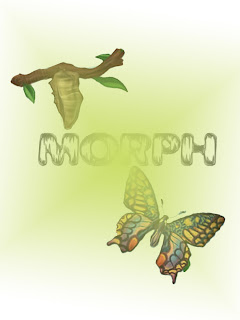
I chose to use the word "morph" because I like what it symbolizes. When I think of things changing in form the first thing that comes to mind is cocoons and butterflys. I found the font on the internet called weathered and I thought it fit well with the theme. To make the green background I choose a green fill layer in the shape of a diamond an extended it to the edges of the page. I also used the shading filter to make "morph" look more "morphed"

Poster 2


I still focused on the idea of health care reform.
I chose not to use any text for this poster.
I chose the images based on the key components of the players of reform in this country. I used a lot of distortion filters to create the feel of the circular motion. I thought it looked bold against the black background. This version is a lot more serious than my original.

Tuesday, October 13, 2009

Poster Project


I choose to uses cartoon graphics for this health care reform because I feel that it makes the concept of the poster easily understandable. The symbols are bold and represent the different aspects of the system. A lot of these graphics had to be cut away from there background so I used the magic wand tool to select and cut and paste the images to the final document. I selected the new fill layer to add the color. I used the text box in photoshop to add the phrase. I chose white so that it would pop off the page. My goal for this poster is that it would be simplistic.

Thursday, October 8, 2009

Collage 2


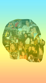
This was a completely different take from my first one. The outline is actually Obama's profile but I used all pictures of me and layered them using the clipping mask tool. The pictures were then able to form directly to the shape of the face. I thought that it needed a background also so I used the gradient fill tool and played around with the colors until I got something that was bright but still transparent enough to see the images clearly. I struggled a little bit with merging the layers together because there were several layers at one point. It's useful to know that if you hold down the apple key and click on the image it will navigate you directly to that layer. I enjoyed this project.

Collage 1


Obama's Inauguration was definitely one of the most influential days of my life and the images that were captured that day outline a part of who I am. I choose to use the American flag as the background and guidelines to my personal collage because I thought it was suitable to the topic. My goal was to my political and patriotic side. I especially liked using the burn out tool because it made the black from the images pop against the red and white background. I set my favorite image of the capital building as the background by lowering the capacity. I only left two pictures in their normal filter and angled them to make them seem as though they were in the foreground.

Thursday, September 24, 2009

Moving Images


When I first thought of this project both water and wind came to mind. They are both calm and when I imagine them, I see them in motion.

I found this great image of the sailboat on a great background and attempted to make it seem as though the sailboat was in motion but disappearing with the tide as well.

It ONLY took me 90 minutes to erase the entire background surrounding the boat to be able to just have the boat seem as though it was traveling on the same water. The image is from the perspective of the someone watching from shore. Although they know the water is moving as well the boat seems to sail by while their mental image remains on the background.

I used the filter "wind" to make the transition of the boat diasppearing from the viewers mental image seem swift yet soft at the same time.

Thursday, September 10, 2009

Adding the image

Today I got feedback from the class on the format of my poem. I decided I liked the font but that the title didn't seem like much a title at all and needed to balance the white space on the right side of the page. I originally played with fading the previously bold words, but when I chose to use the dragon image as my background, they blended in too much. This image drew my attention but I still liked the format of the poem and wasn't willing to change it. There wasn't much open space for the image so I enlarged it and made it opaque by adding a white layer using the fill button. Then I transferred the image to In Design by saving it as a jpeg and "placing" it on my already edited poem. I like the boldness of the black and white but in future projects I'm looking forward to experimenting with color. I have used Photoshop in the past but it has so many features that it is a bit overwhelming for the "second" first time. I am excited to play around and get to know In Design better as well. *Key that I need to remember is SAVE AS JPEG, I wouldn't be able to upload anything on to this bog otherwise.

Thursday, September 3, 2009

IDD Beowulf Poem


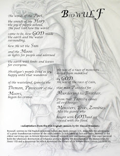
Hooray, my first day of IDD experience ever! I choose the Beowulf poem to design a layout for because the words had potential to be fierce and jump off the page. My goal was to make something stand out since my only knowledge of graphic design, as of yet, is to create something visually appealing. My thumbnail, although larger than the size of a thumb, actually portrays my final product. I used "In Design" to create this (Image to the right). I wanted to have the paragraphs side by side but still seem to flow in sequential order towards the bottom of the page. I chose to increase the font size of words that correlate with one another. I wanted to emphasize the authors use of God in order to illustrate the theme of the poem. Both the title at the top of the page and the author at the bottom are in Lucida Handwriting. I wanted it to seem as though the author was signing the poem. The rest of the poem is printed in Lucida Calligraphy. The explanation of the poem is printed more simply in Lucida Bright.